top of page


Animated Stamps (2024)
With elements created in Illustrator and animated in After Effects, I created a set of 'animated stickers' under the self imposed theme of limited colors and expressing emotion. Each stamp correlates to a specific emotion and is shared between cartoonized versions of my dog and myself.


New York Asian Film Festival (2025)
Created movie showing posters, added laurel logos to existing posters, and created graphics for social media under a preestablished neon branding.

Playing Cards (2023)
Hand-illustrated, these cards are a mockup for a full deck under the self-imposed theme of surrealism and an original character for a game. Callis, the character, is the protagonist of lethe., an RPGmaker game about the importance of not forgetting loved ones in grief.
The art direction intended to be harsh and vibrant with organic shapes. The question I wanted to explore: how vibrant can I make an illustration of a character whose primary hair color is white and whose other prevalent color is red?
Red, black, and white are already an iconic combo of colors, so I also did not want to dilute the mix too much with other colors. I ended up choosing a purple tint for the hair, which balanced out the other cool-color accents and gave the overall designs more cohesiveness. I also added grain and noise to allow for a softer, more dreamlike vibe.


Layout samples for different numbers
Final version of one number card and an iteration of a face card
Full render of a face card
SAL Poster Mockups (2025)
Different poster mockups for NYU Tisch's Student Animation League Animation Festival.


Final version with multiple layout and a card back
TCG Cards (2023)

Designed for 'Kids War', a TCG game with classes and stats, these sets of cards are influenced by old storybook decorative elements and risoprints.
A few wireframes were conceptualized with the aim of having most elements feel ornamental in addition to having a game design component. For example, the health stats in one design were represented by stars. The classes were indicated through the colors, but the layouts remained the same.
After wireframing, wireframe 2 was chosen to be developed on. Ultimately, the right card was chosen to be iterated on. Elements were adjusted to align better, and icons were developed to indicate what the numbers correlated to. The spiky, warm colored shape indicated attack, while the cool-colored shield indicated defense points. A mockup of the back of the cards was also developed using the main background colors for the cards.
The fourth image at the bottom is a moodboard, conceived after wireframing.


Card Wireframes
Fourth iteration of card layout (with visuals)
Moodboard + Font Exploration

Screenshot from player interface

Moodboard

IMAGO Interface + Moodboard (2023)
A concept screen for a game in development. IMAGO is a puzzle platformer with first person adventure elements and a UI inspired by Japanese 90s visual novels. Following the theme of a low-technology eldritch world, the interface had to fulfill a few goals: have limited amounts of windows the player had to navigate through, include an inventory system that felt diegetic, and have some sort of order through what would be a maximalist, decorative layout. The inventory system would be a crafting system, and because the main character was a field journalist, there would be a field journal that would dynamically update as the player encountered fauna and flora in the environment.
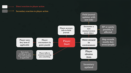
There were three phases of this iteration: an AUDIT, which established player interactive flow and the audience/persona for the game, a MOODBOARD, which established tone and visual direction, and a WIREFRAME, which was iterated into an INTERFACE through playtesting.
Three iterations were made: wireframe, then two iterations of a medium-high fidelity interface. The second interface focused more on the actual screen, and the save/load menu files were scrapped as the save mechanics were reworked to be like Resident Evil where players would have to save in-game at certain checkpoints.
Throughout the design process, a few rules were established: one, the color red promotes interactive objects. Two, the textures outside of the main gameplay window would be more realistic. Lastly, text had to be sized relative to the text box - the text in the dialogue box was the most important.
User interaction flowchart

Competitive/Comparison matrix

Persona for the game's audience

Concept art for Terratrials
Terratrials UI (2024)
Terratrials is a project for Major Studio (Spring 2024) using a synthesis of Scrum and Agile. Within a team of seven people, I was assigned to do UI and supporting artwork/design after the concepting phase.
This project's main themeing is a sort of sci-fi biopunk world where the player dodges a bullet hell/enemy attack and uses the amount of time they survive in a level to unlock different levels. Thus, in contrast to the sterile, industrial environment that descends into fleshy hell, I had to brainstorm a UI that would stand out.
Because the player character is in a suit, I decided the UI would mimic a semi-diegetic digital interface that overlaid within the world. Due to the game's eventual descent into a dark, purplish-red color palette, I decided yellow would be the best to stand out in contrast.

Layout sketch for audio/settings menu
Early build video

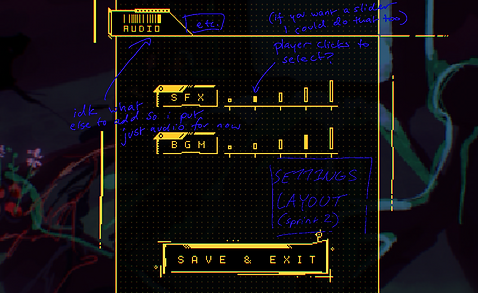
Layout pass for audio settings menu (annotated)

Layout sketch for pause menu

Finalized assets for pause menu (sample layout)
bottom of page